Every year, there are many trends to look out for. Our favourite media try to decode the design directions for the coming months. But are the shared design trends a lever for a more responsible and less energy-consuming design of our digital services? Or, on the other hand, are they aggravating factors of digital obesity? Let's take a look at the main trends and ask ourselves this question.
1 - AI at the service of design
Artificial intelligence is an innovation that has more than made its mark, shaking up all our design thinking and our vision of the profession. We are no longer in the business of doing but in the business of make it do. Production is done by this intelligence and our intelligence consists in putting words to what we have in mind and guiding this assistant/producer.
Easier creation but what impact?
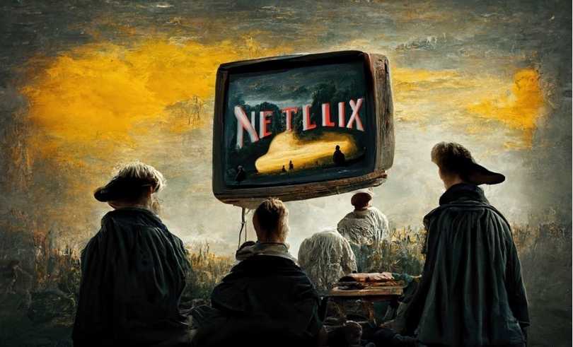
Indeed, designing an illustration with DALL-E or Midjourney (the best-known AIs for visual design, the image equivalent of ChatGPT at OpenAI) is not without environmental, social and societal impacts. Firstly, intelligence means learning. To be able to design the illustration corresponding to our description, DALL-E was trained on more than 12 billion images and performs very energy-consuming calculations. There is no precise measurement of environmental impact, as studies collide on different results. But what we do know is that statistical learning requires datacenters, electronic equipment capable of mobilising more than enough computing power, and a network to transmit the information to us. Each of these components has various environmental impacts: water stress, increased consumption of abiotic resources, electricity consumption, CO2 emissions, etc.
Does the widespread and massive use of this technological prowess have a place in a future with finite resources?
From a design point of view, its proponents claim the arrival of a great help that pushes the boundaries for creative people. On the other hand, some fear a great replacement and a loss of value for their professions. This tool has the potential to open up the field of possibilities, by letting creatives imagine and AI execute. It can even reproduce painting techniques from different eras or artists' styles, which also raises the question of intellectual property rights.
The openness is immense. Only the way it is used will make it a "good" or "bad" tool
2 - Increasingly crazy typefaces
The boom in extravagant, bold, spacious and imposing typography continues. We continue to live a beautiful period carried by brutalist and minimalist styles adorned with straight, strict and sans-serif typefaces. Now the letters play and dance on our screens in the most beautiful colours.
We love it and we recommend it. Why do we recommend it?
Because beautiful, radiant typography can brighten up websites without weighing them down. Because we're proving that it's possible to combine cheerful design with eco-design. The Sam Fairbairn website is a good example. An interactive typography that reveals the site while reducing its CO2 emissions by 79% compared to a "classic" site (according to the calculations of lowww.directory).
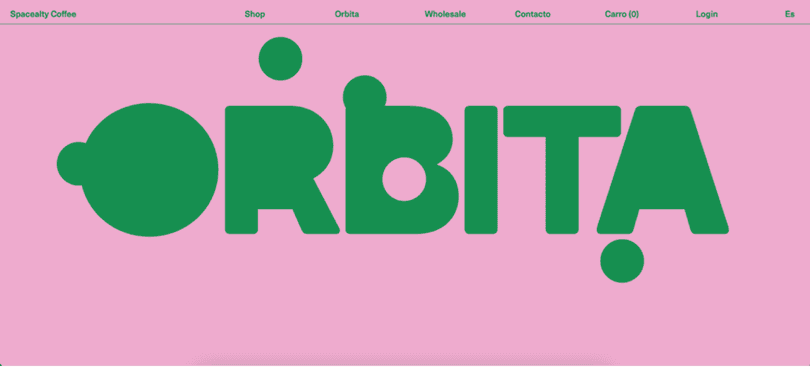
A beautiful world conveyed by typography can also limit the sometimes unnecessary addition of images. A beautiful typography brings attention to the message when some images or animations can (if used too much or badly adapted) blur it. But it is also important to choose the right typeface, the one that will reveal your identity but also guarantee good readability and accessibility for users.
Did you know that Comic Sans is ranked among the most universally readable typefaces?
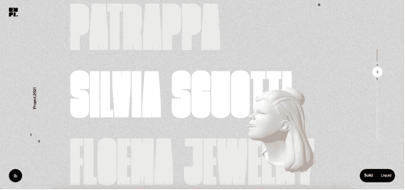
If we look at the Empiempi website, the use of the Bulevard typeface in upper case brings a stylish effect but makes reading much more complex.
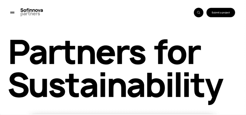
On the other hand, Sofinnova partners uses a beautiful typography while keeping a good readability.
3 - Customisation galore
Nostalgia is a universal feeling and one that more and more designers are playing on. Our childlike soul likes to be in charge and play. The interactivity of a digital service is therefore increasingly being explored. As a user, by modifying the digital service we are on, we add our personality and uniqueness. The Praticable site (formerly the Bam collective) proposes that we shape our own path and order the content as we see fit. Wouldn't this be the way to shape the perfect user experience - our own?
Personalisation can also limit the impact.
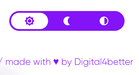
More and more websites are inviting us to choose the mode we want: darker, less energy consuming, or more contrasted... The user has more and more control. And in the context of eco-design, it is quite possible to display the "frugal" mode by default and give the user the possibility of changing it. This is the approach taken by the Accor group's corporate website. At fruggr, the customisation of our interfaces is also a way for us to adapt to the working comfort of each individual. Interactivity is not incompatible with frugality, you just have to find the right mix.
4 - Science fiction and retro-futuristic dreams
Gaming universe, campaign worthy of a Marvel release and surgical precision of 3D, the designers want to take us out of our reality to plunge us into improbable worlds. We are in an era where technophiles idolise augmented reality, metavers, artificial intelligence and other digital follies. From these futuristic reveries, creatives extrapolate from their bubbling brains designs that imagine our future. This is the case of the Cash App and Ever websites, which send us 3D and autoplay galore to sell us hyperconsumption and a smart city.

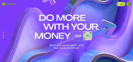
They put on a show for needs that are not really needs, artificially created or whose environmental benefits are sometimes just a façade. Let's not forget that in most cases, these animation extravaganzas are detrimental to loading performance, information readability, accessibility and compatibility on most mobile screens. In short, the wow effect does more to counteract a good user experience than to enhance it.
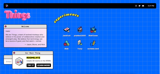
On the other hand, the followers of Windows 1.0 reinvent the digital world of the 80s and 90s to rebuild efficient and modern interfaces. Basically influenced by gaming universes, we find colourful and sober designs, putting more emphasis on typographies and pixelated icons. The site of the Things agency is a good example of this.
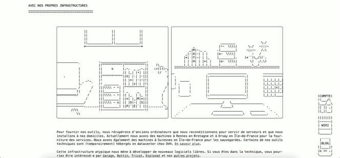
The site of the agency DeuxFleurs plays on the fashion for ASCII (American Standard Code for Information Interchange) drawings made with special letters and characters. Old school vibes, the site also has the advantage of being very light, animated and easily navigable.
Conclusion
Designing with today's environmental and social issues in mind is a challenge we cannot escape. This one is beautiful and brings the design thinking of l_ess is more_ to the forefront. But knowing how to be sober does not mean being ugly or poor, colour, drawing, shapes, nothing is forbidden and everything is possible if it serves the experience, the emotion and does not undermine the impact. So get your tablets, mice, trackpads and paintbrushes, tomorrow's design is being designed today!
